Books
Here are a selection of books produced over the last 40 years. There is ‘A Book of Books’ just published and it can be seen and purchased here.
The books are in many public collections including, Victoria & Albert Museum, Tate Library, British Library, Museum of Modern Art New York, Yale Center for British Art, Royal College of Art Library, Winchester School of Art, University of Brighton, Bodleian Library, Arts University Bournmouth, University of the West of England Bristol, Biblioteca Nationiale Centrale Florence, Humanities Research Center University of Texas at Austin and Special Collections U C San Diego California.
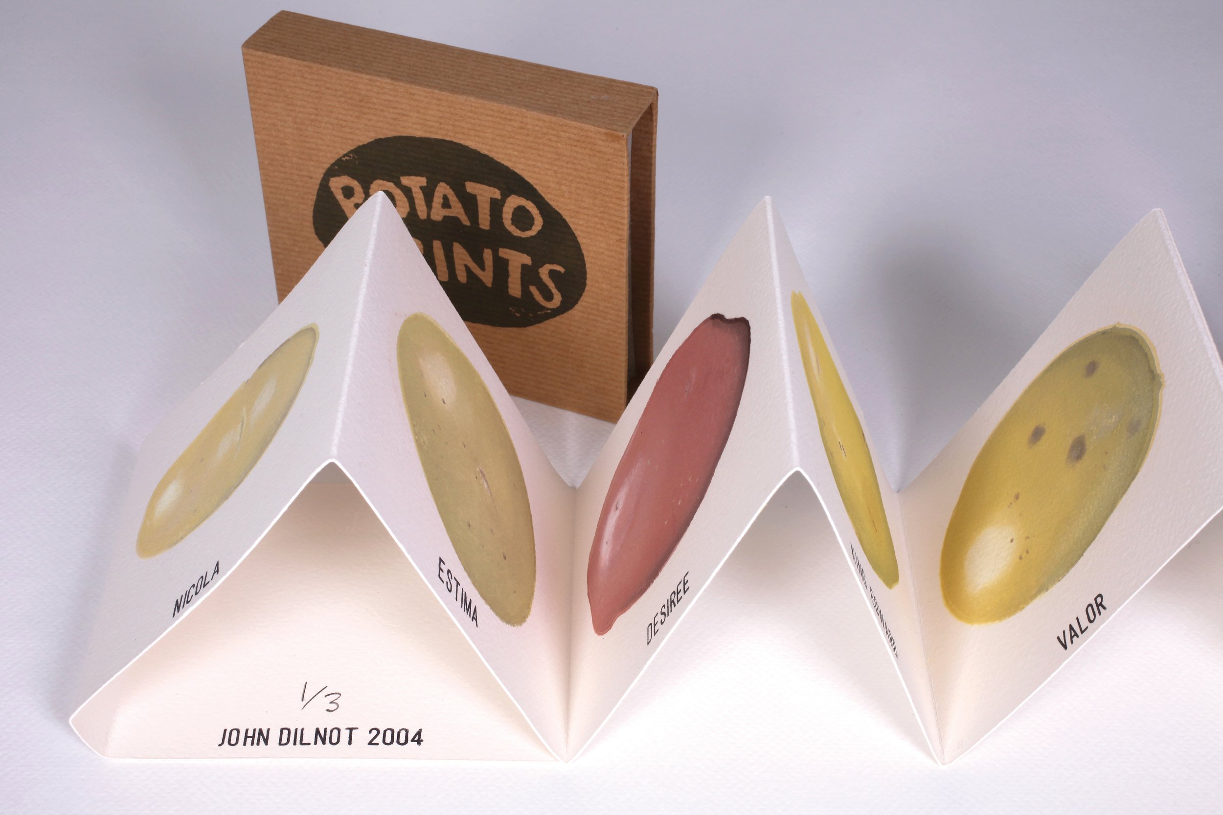
Potato Prints 2004 - Hand printed with potatoes. Potato prints are traditionally made by cutting a potato in half and then cutting a design into the cut surface which is inked up and printed. My concept was to try to print the likeness of the potato by cutting the chosen potato in half but leaving the surface plain and uncut. I chose twelve varieties of potatoes from several supermarkets and chose a large potato from each bag. Taking each in turn, I cut the potato in half, inked it up and printed it to achieve a flat potato shape. I then proceeded to ink up more selectively across the surface using different colours. It took six or so printings until the likeness of the potato was achieved. I inked up a dark colour around the edges to make a shadow, a white spot to get a highlight and some brown spots to print eyes. It was difficult to print with a lot of mistakes and I ended up with only three books. I also made a Little Book from it. Potato Prints 2004 edition of 500 10pp inkjet and rubber stamps

Ten English Homes 1991 -Ten English Homes is a cardboard box of screen printed cards that was produced to accompany a window installation for Cornerhouse gallery Manchester. Like Rural Views, the imagery is adapted from illustrations found on food packaging, mainly dairy products. Here, my selection focuses on idealised country cottage imagery. The image left, shows a screen print using the same artwork as the cards. These prints were displayed in the gallery space butted up wallpaper style, resulting in a continious frieze.
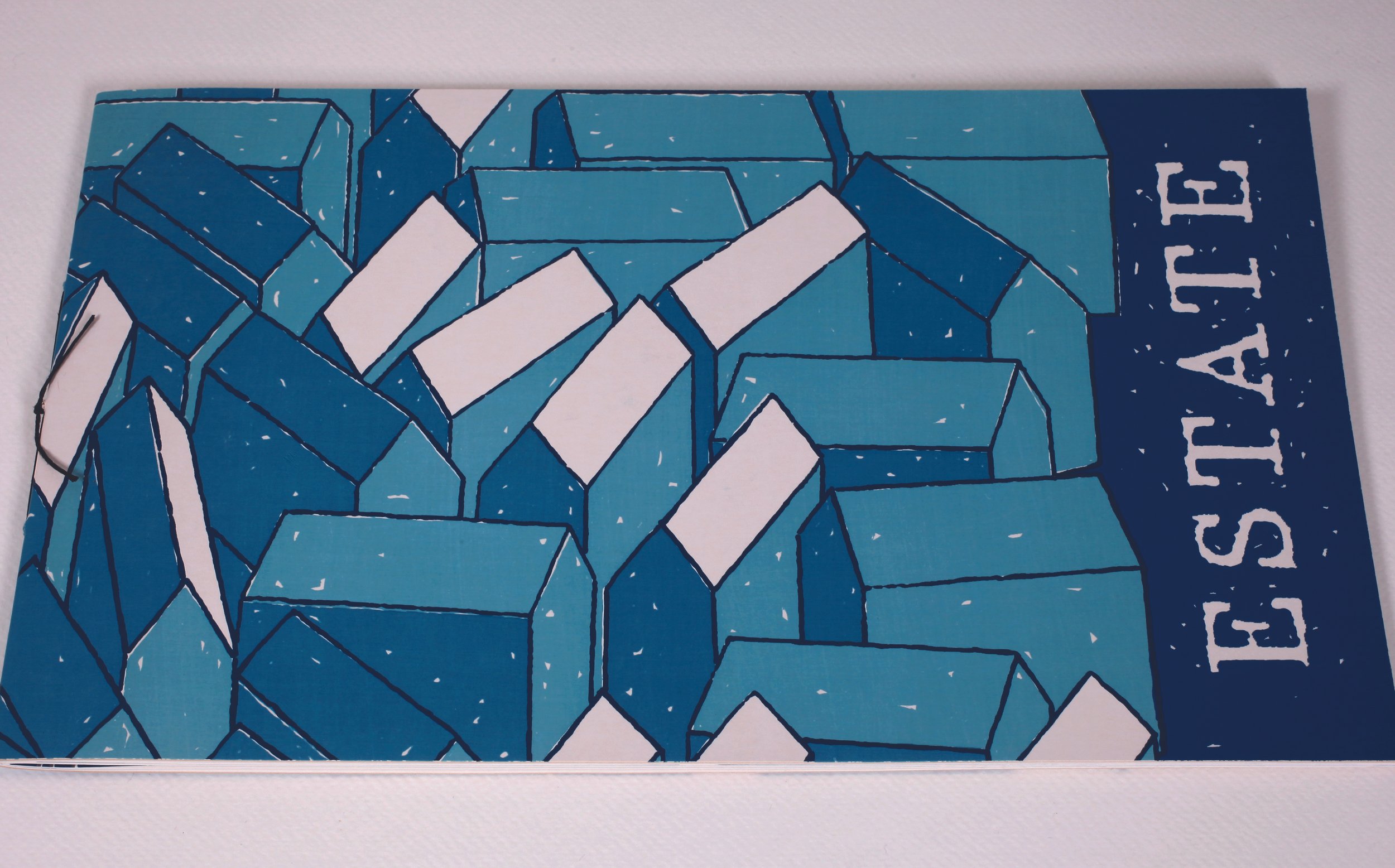
Estate 1990
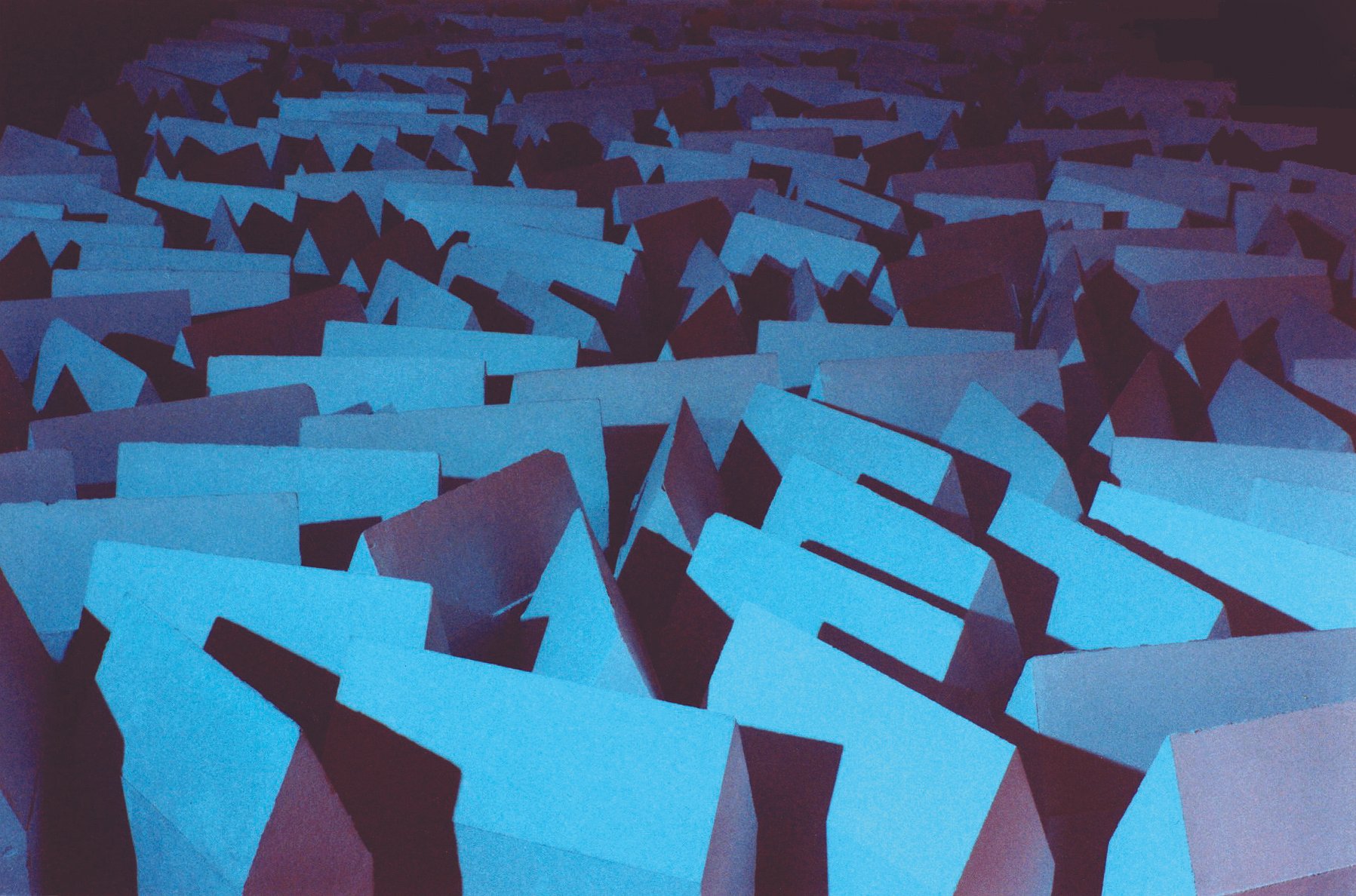
Estate was commissioned by Oldham Art Gallery and it consisted of an installation and a book work. I liked the idea of making two completely different things. The book being a small intimate object, produced in multiple and lasting beyond the exhibition and the installation, a large temporary structure. The book consists of a collection of sixteen drawings depicting houses, screen printed in up to three colours. The installation is the realisation of one of these drawings. It consisted of 300 white plaster house forms (each 30x30x10 cm) packed tightly in a random fashion on a large low platform. The only lighting in the gallery space consisted of two blue spotlights trained on the houses.

Rural Views 1990
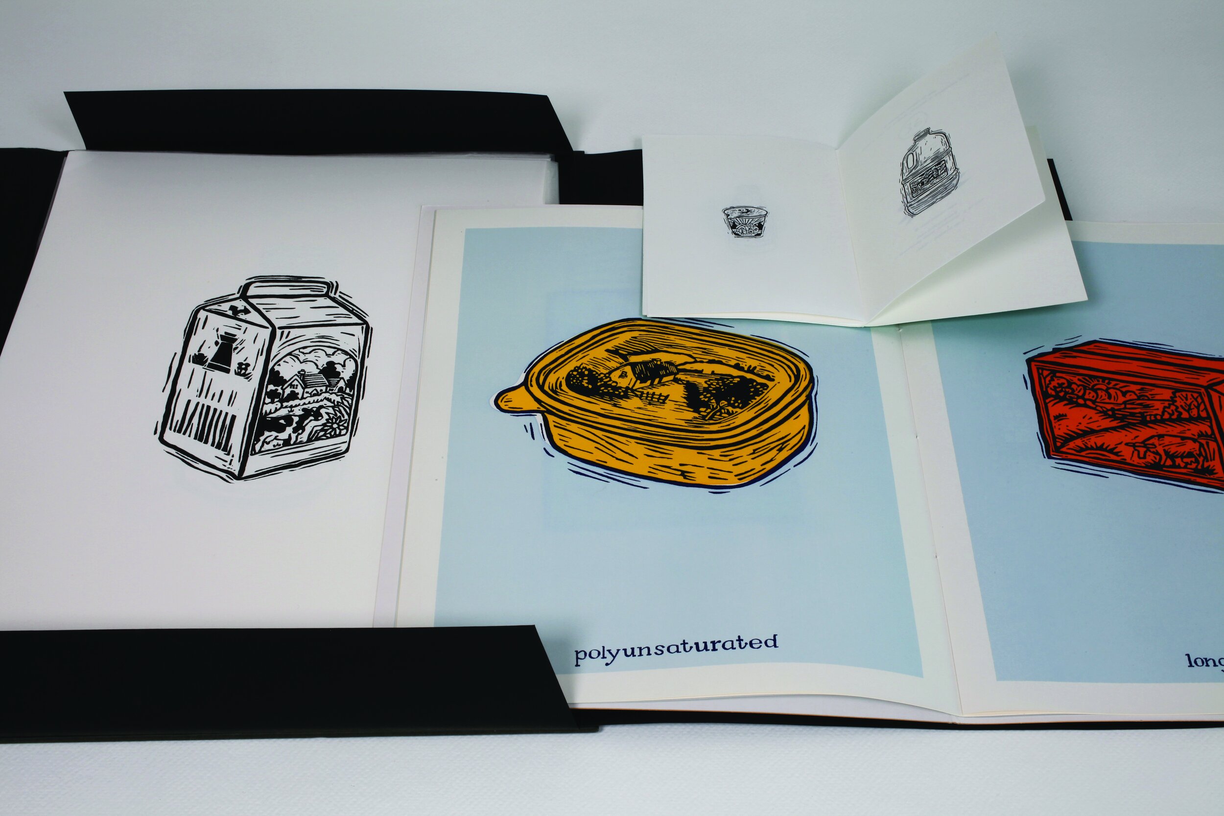
At the time, imagery of pastoral scenes, usually of cows and cottages on food packaging was in abundance. Most of the illustrations had the appearence of linocuts and so I decided to take a step back and make a linocut of the whole food package. The original edition of Rural Views was a folio of nine linoprints. I also a produced small photocopy edition. In 1996 I made a screen print version in colour.
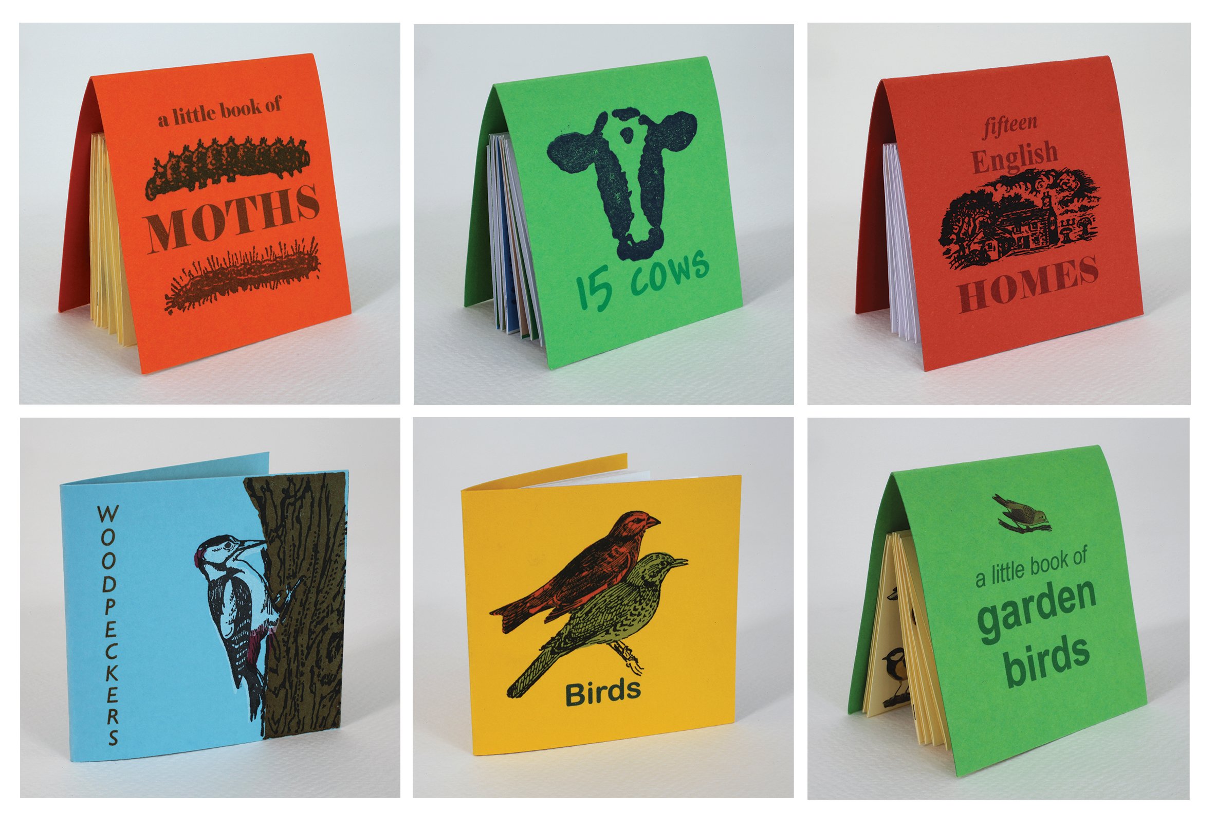
LITTLE BOOK SERIES 1994 - 2008. I decided to produce a series of books which had an element of uniformity, used a similar amount of materials and importantly, I wanted them to be easily affordable, they were initially £5 each. I had limited means of production and the first Little Book I made was Saplings which is printed entirely with rubber stamps. The next two books, 15 Cows and Fifteen English Homes, were made with photocopies and hand cut rubber stamps and were initially made in black and white. In the mid 90's I bought a computer and started to use inkjet printing. A Little Book of Moths was the first to be designed for inkjet printing. I liked the colour and revisited some of the earlier books introducing colour and continued those editions in colour, printing them in inkjet. Some of these books therefore were not rigid in production but could evolve each time I made a batch.
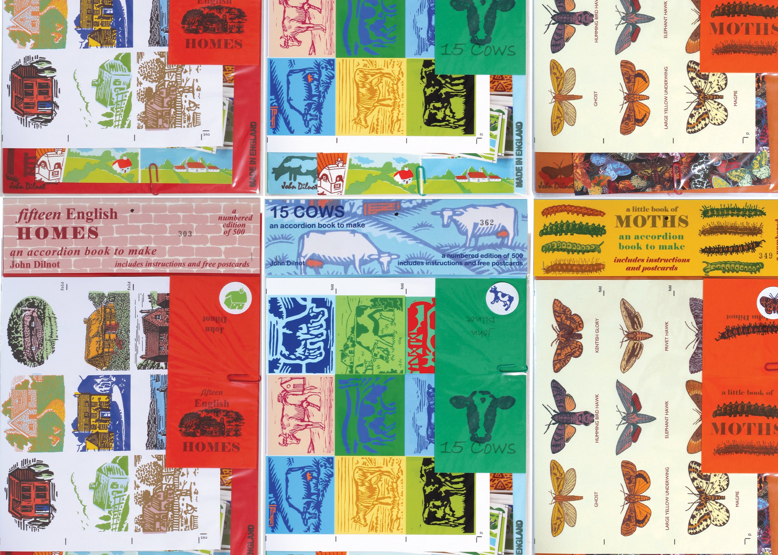
Most of the books were designed to print on the A4 sheet format, using all the sheet in an economical way and exploring different ways to divide the sheet. The inside pages were made from one A4 sheet which was cut up and folded in different ways. Predominantly the sheet was cut into 3 strips and glued together to create a long accordion book. The cover is a sixth of A4. The books were sold in a pack with a cardboard insert (third A4 ) and a postcard (quarter A4). All the books are in numbered editions of 500. I also published some of the books as ‘make yourself book kits’, in numbered editions of 500. All the elements to make the book including extras and instructions were placed in a bag which was designed to be an artwork in itself, even if not made.
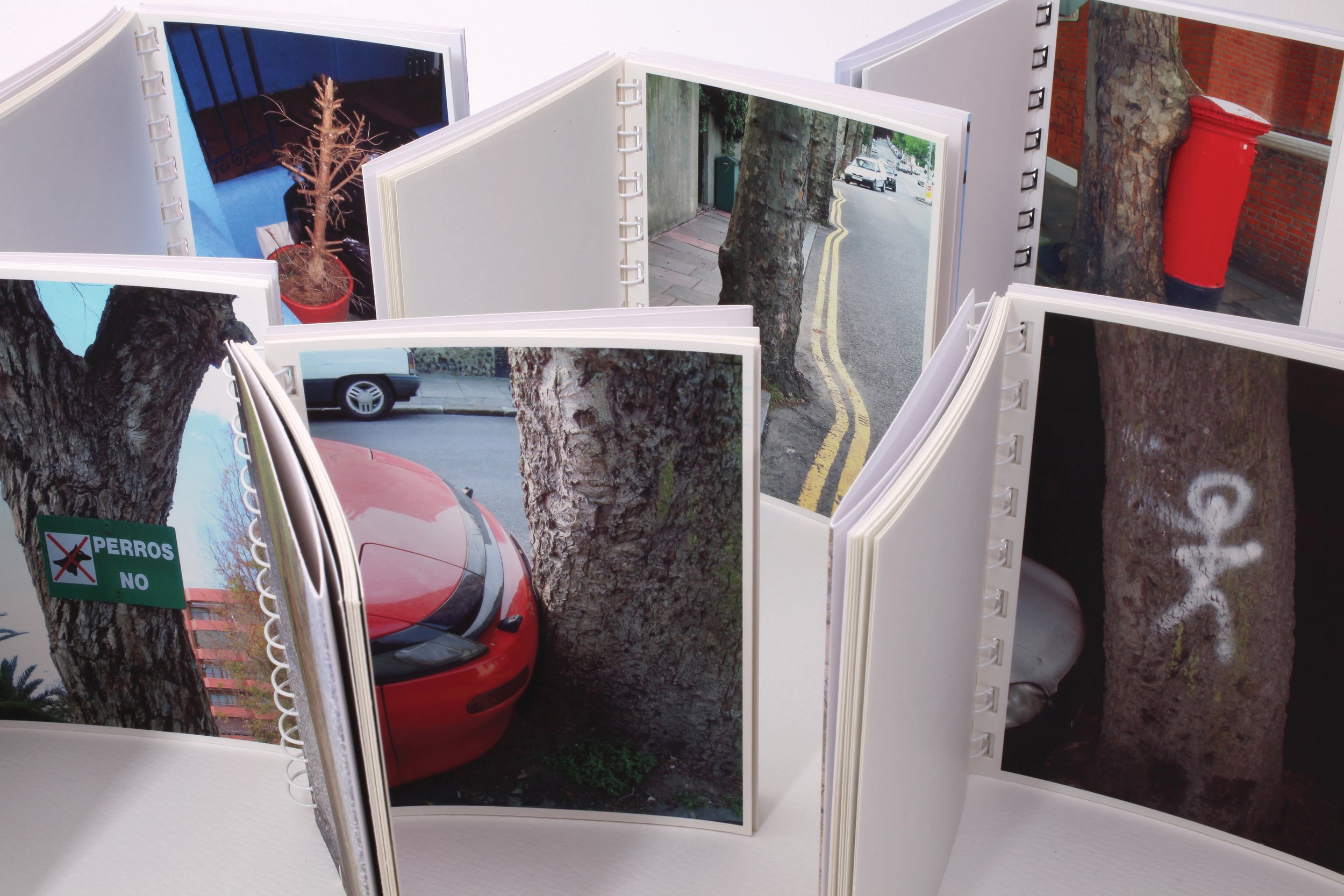
Urban Tree Series -Whilst I was studying painting at Camberwell in the early 1980s, I noticed near to where I was living a tree trunk in the front garden of a terrace house. The trunk had a neat little white picket fence placed around it which, because the trunk was cut close to the ground, must have been put there after the tree was cut down. I revisited and photographed it several times. I thought it odd and unexplainable, neat and tidy and destructive, like a little graveyard plot. I then started photographing other trees I came across in urban situations, trees that had been affected by a human intervention of some sort. I continued collecting photographs of trees whenever I discovered them. It was an occasional project and I never went out hunting, it was more of a way of seeing and once I had it they seemed to be all around. It was not until about twenty years later that I decided to collect them together to make a series of books. I began producing Urban Tree books in January 1999 when I noticed Christmas trees being disposed of in often quite drastic ways. Some being cut up or heavily pruned and others concealed in black bin bags. Many of these had the resemblance of crime scenes, bound and wrapped for disposal like a human body. Some of these were also photographed at night with a flash which added to the drama. Four other books, Attachments, Boundaries, Space and Communication are accumulated photographs I took over twenty years and sorted into themes. I used to visit Alicante in Spain quite often and during one visit I decided to start photographing the urban trees there. Because there is a fundamental difference with the species of tree and how they are treated, I decided that this should be a separate project. Spanish Urban Trees is the outcome but it also initiated another project, White Poplars, which is a book just about one avenue in a suburb of Alicante.
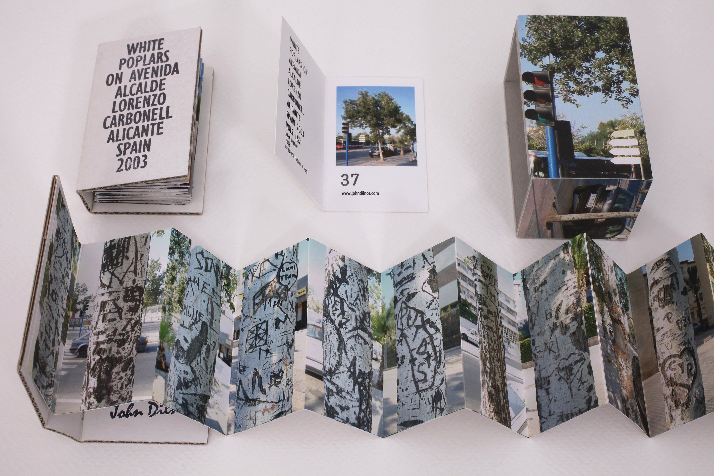
White Poplars was an idea that came from regularly walking this street in Alicante. It is a very busy avenue with blocks of flats, a school and several other other public buildings all set behind a continuous row of white poplars down the length of the road on both sides. I noticed that the tree trunks had been the subject of a great deal of cut graffiti, the cutting creating a black scar and raised surface which enlarges and gets bolder with age. The result is very strong and graphic . I photographed every tree trunk in the long avenue in turn, firstly down one side of the road and then back again down the other side. One volume of the book shows one side of the road with the trunks in consecutive order and the other volume contains the other side of the road.